
Table of Contents
Tools is accessible at - tools.exerra.xyz
Utilities had a lot of problems - some big, some small, so I eventually ended up making a replacement - Tools.
This post is meant to explain my thought process behind each decision and to ultimately, hopefully, be the first of many reports of old outdated projects being updated to my modern standards.
⚠️ Bit of a spoiler, but Utilities is no longer accessible as it redirects to Tools. ⚠️
Backstory
Back in late 2022 I had a problem. I was doing design work with software that didn't respect aspect ratios when resizing. It was relatively fine when I was just working with standard aspect ratios and standard resolutions (e.g. 1920x1080, 1280x720 when 16:9), but quickly became quite a large pain in the butt when working with non-standard aspect ratios or even non-standard resolutions within standard aspect ratios.
For a while I ended up either just guessing (which, of course, didn't go down that well), or calculating the missing height/width myself. It was fine for a while, but that became too tiresome as I would have to punch the formula and numbers in every time I needed to calculate it, and sometimes I even had forgotten the formula!
Now, thankfully, sometime during late 2022 I came to the realisation I am a programmer and that I can just simplify the whole thing... so I did. I made it mostly with just one category and one tool in mind, which, in hindsight, was the worst thing I could have done.
Issues
Websites have 3 categories with which we can label issues - design, performance and functionality. I will cover all 3 seperately, and then in a different section following the same format I will explain how I fixed it.
Design

The design for Utilities was very simple, childish, colourful and full with paddings. At the time I had finished making a project which had a very similar design, and, in my opinion, a design that still fits the project. However, I made the fatal mistake of taking the same design, removing key elements that made it look good (e.g. images) and forcefully cramming it into Utilities.
The result was a very big mess that wasn't optimised for mobile at all.

As you can see in the image, the titles and descriptions are way too big, leading to a lot of scrolling and a general "zoomed-in" feeling. That especially sucks when you have to quickly make changes (e.g. you have multiple coefficients to calculate, and to calculate every one you have to scroll quite a lot).
In the index page the cards didnt make good use of the space. They had a title, a big icon and... that's it. Taking up like ¼ or ⅕ of the screen just for a title and icon is actual UI horror.
Now, I'm not sure how many people were on mobile (if there were any even), but I personally ended up using Utilities mostly on mobile, so these issues were too painful to ignore.
Performance
With the increased latency of mobile data, navigating Utilities felt a bit sluggish on mobile as it was a NextJS multi-page application (MPA) rather than a single-page application (SPA). MPAs do have some benefits, especially if you have quite "light" pages (e.g. not a lot of stuff to load on each page), however due to the fact that Utilities was built with NextJS and thus with React, it did have some beefy JS to load.
Functionality
This is the most nitpicky of them all, but it does degrade the UX for mobile users - useless buttons.
Now, buttons themselves aren't useless if you have something that should only fire once and only fire when the user has inputted all of the data... however in this case it was useless.

Let's take for example the Death/Birth Coefficient Calculator. What difference does it make if the coefficient gets calculated every time you change a value, or if it gets calculated on a button press?
Simple math isn't resource intensive, so it is not that. It isn't destructive, so it also isn't that.
There's really no reason to have the button. All it does, is generate extra steps for the user. Desktop users have to pick up their mouse, drag it to the button and click it. Mobile users have to scroll down the (very badly designed and zoomed-in) UI.
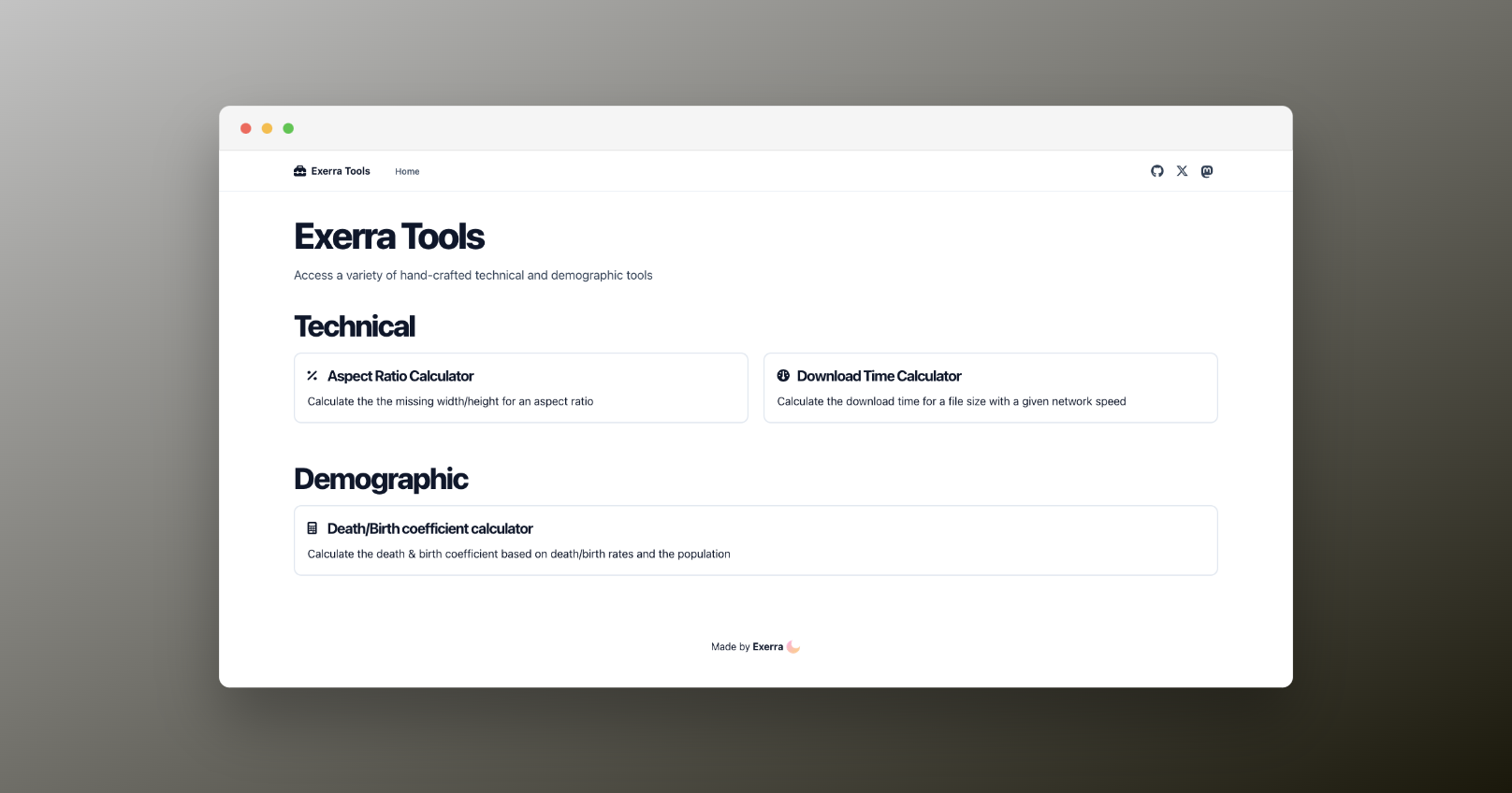
The redesign
As the redesign ended up being quite professional, I ended up going with the name "Tools". It is easier to type, has less characters to read and just rolls off the tongue easier.
Design

For the design my main goal was to make it look clean, professional and tidy it up a little, a.k.a. get rid of the useless padding. For the design I ended up taking cues from shadcn/ui, which I have already used for ChromeOS Releases and although I ended up not using the library itself (due to performance considerations), I did end up copying the style a bit.
Now not only does the desktop experience get better as everything fits without having to scroll, but most importantly the mobile experience gets MUCH better.

The index page is already packed with more information (descriptions), while still showing more cards than Utilities.
The tool page now finally relegates just a relatively small amount of the page for the title and description, leaving the rest to the input fields. Words cannot describe how much better this is, so I will just show you!

As someone who really hates unnecessary actions and most importantly the "zoomed-in" feeling, the new design is just... awesome. I can't think of a better way to say it.
Performance
Remember how I talked about MPAs and SPAs? Yeah, well that's not the only thing different now.
Tools is now built with Astro and React. Astro is a very optimised and amazing framework that even, somehow, managed to optimise React. The difference between MPA performance of Astro (w/ React) and NextJS is already insane, however it gets better.
Tools as an MPA works much better already, but what if I cached the important stuff and made it into an SPA? Well, I did!
Using astro-spa I managed to (very easily!!) convert Tools from an MPA to an SPA. It doesn't really change much if you just directly go to a tool (especially because it doesn't really add that much JS), however if you go to the index and navigate to a tool, or just traverse the tools, you will immediately feel the... fastness?
⚠️ While writing this post I did end up finding a bug with the SPA. If you use Firefox the required scripts for the calculators don't load if you start on the index page, but if you start on a tool (which loads in the React scripts), everything works fine. I might end up disabling it on Firefox browsers if it keeps happening, but hopefully I can fix it
Edit: The bug affects more browsers than I thought. See: issue #3 on GitHub
Functionality
As I alluded to before, Tools now does the calculations automatically every time you input a new value into the fields. This makes the mobile experience much better, as theres no more scrolling, etc.
What now?
Now is the migratory phase to Tools. I have already set up a redirect from Utilities to Tools. I could have just added a banner with a link to Tools, however I thought that I should rather just forcefully migrate users to Tools. I am sorry for anyone affected, but I imagine the slight inconvenience will be outweighed by the massive benefits of the new redesign.
I also have some ideas of what I can put into the calculator:
- Gamepad tester
- Gradient + wave generator
- Microphone tester (spectrum analyser + spectogram)
- JSON to TS types
These are just ideas, and if you have any ideas or just wanna see the progress, or maybe even contribute, the GitHub repository is Exerra/tools :)
 .
You can follow me on
.
You can follow me on